Case Study

Discover new dishes with a social cooking app

Case Study

Discover new dishes with a social cooking app

Case Study

Discover new dishes with a social cooking app

Discover new dishes with a social cooking app

Feasty

Discover new dishes with a social cooking app

Feasty

Discover new dishes with a social cooking app

Feasty

Involvement

Prototyping UX design Visual design

Testimonial

"Vytas is an accomplished, efficient and creative designer. Not only that, but his process extends to the overall business strategy, making helpful suggestions on feature set and product roadmap. He communicates clearly with both devs and product managers, and, thanks to async-first approach, works quickly and efficiently to produce stylish and usable designs." Michael Dunnett-Stone CEO, Feasy

Client

Feasty is building the category-defining platform for foodies. Exercise has Strava, Gaming has Twitch. Feasty aims to be that, for cooking. Their formula is to create a best-in-class product and put it in the hands of the new generation of food content creators: video-first chefs, with millions of followers and heaps of personality. They’re ambitious. And, after getting off to a flying start with their MVP, they’re fortunate enough to have backers who share their ambition. Feasty wants to get more people in the kitchen, having fun while making healthier home-cooked meals.

Feasty is building the category-defining platform for foodies. Exercise has Strava, Gaming has Twitch. Feasty aims to be that, for cooking. Their formula is to create a best-in-class product and put it in the hands of the new generation of food content creators: video-first chefs, with millions of followers and heaps of personality. They’re ambitious. And, after getting off to a flying start with their MVP, they’re fortunate enough to have backers who share their ambition. Feasty wants to get more people in the kitchen, having fun while making healthier home-cooked meals.

Problem & Solution

Feasty came to us with an existing MVP iOS app they designed themselves. Even though the app was working, the UX and visual design needed a complete refresh and a complete front-end rewrite. Since it’s going to take some time, we agreed to first fix the biggest issues with their existing app before designing a completely new interface.

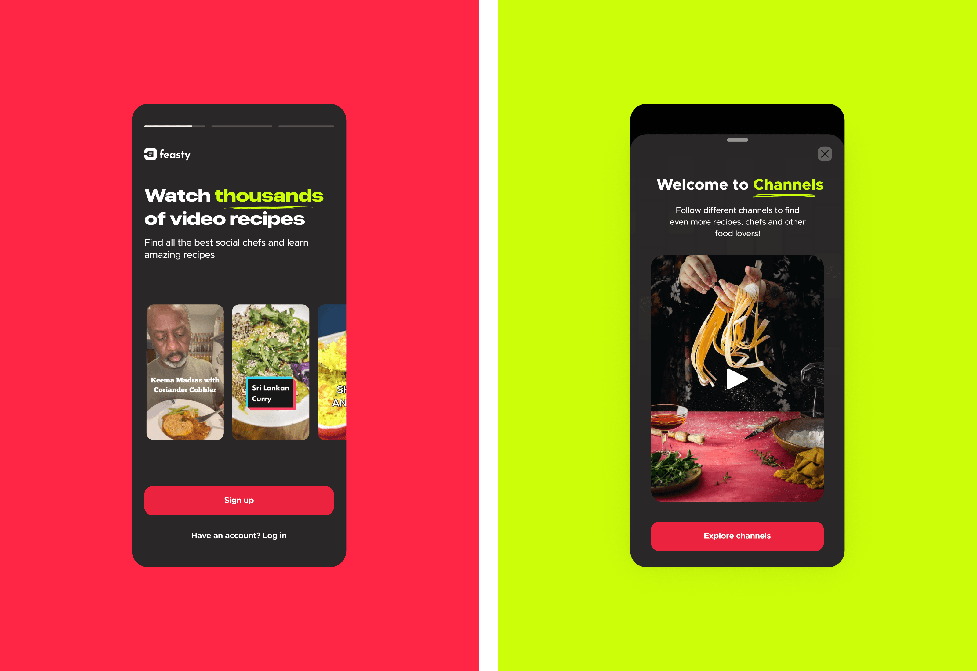
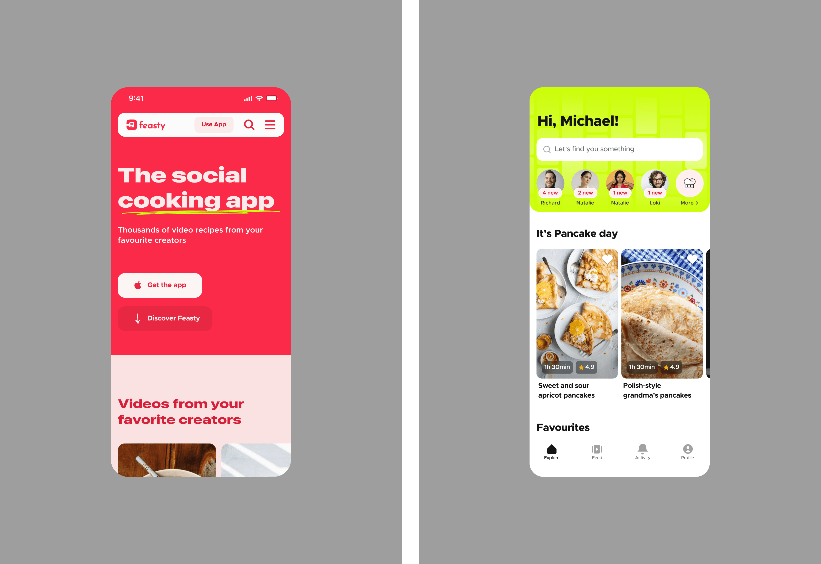
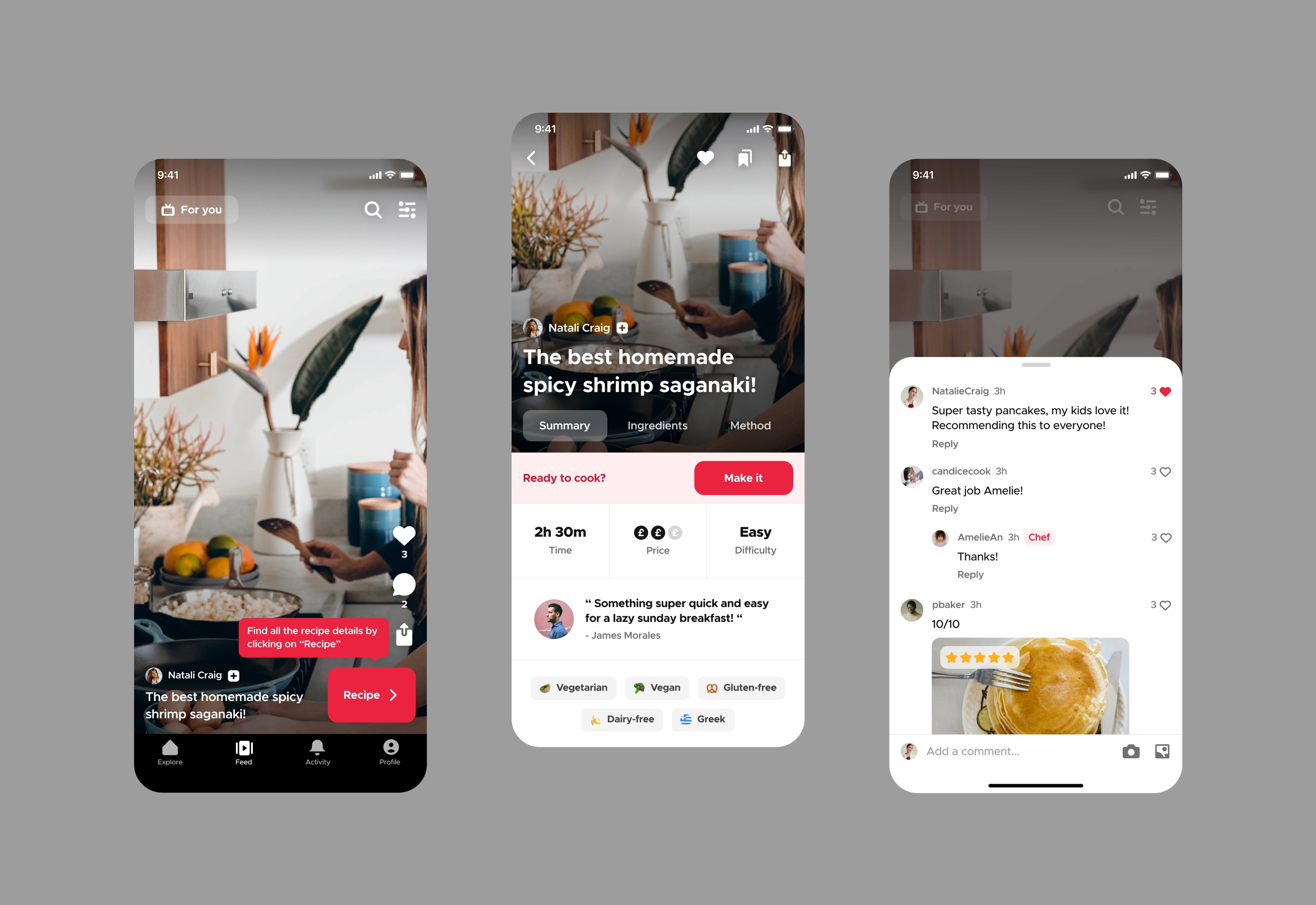
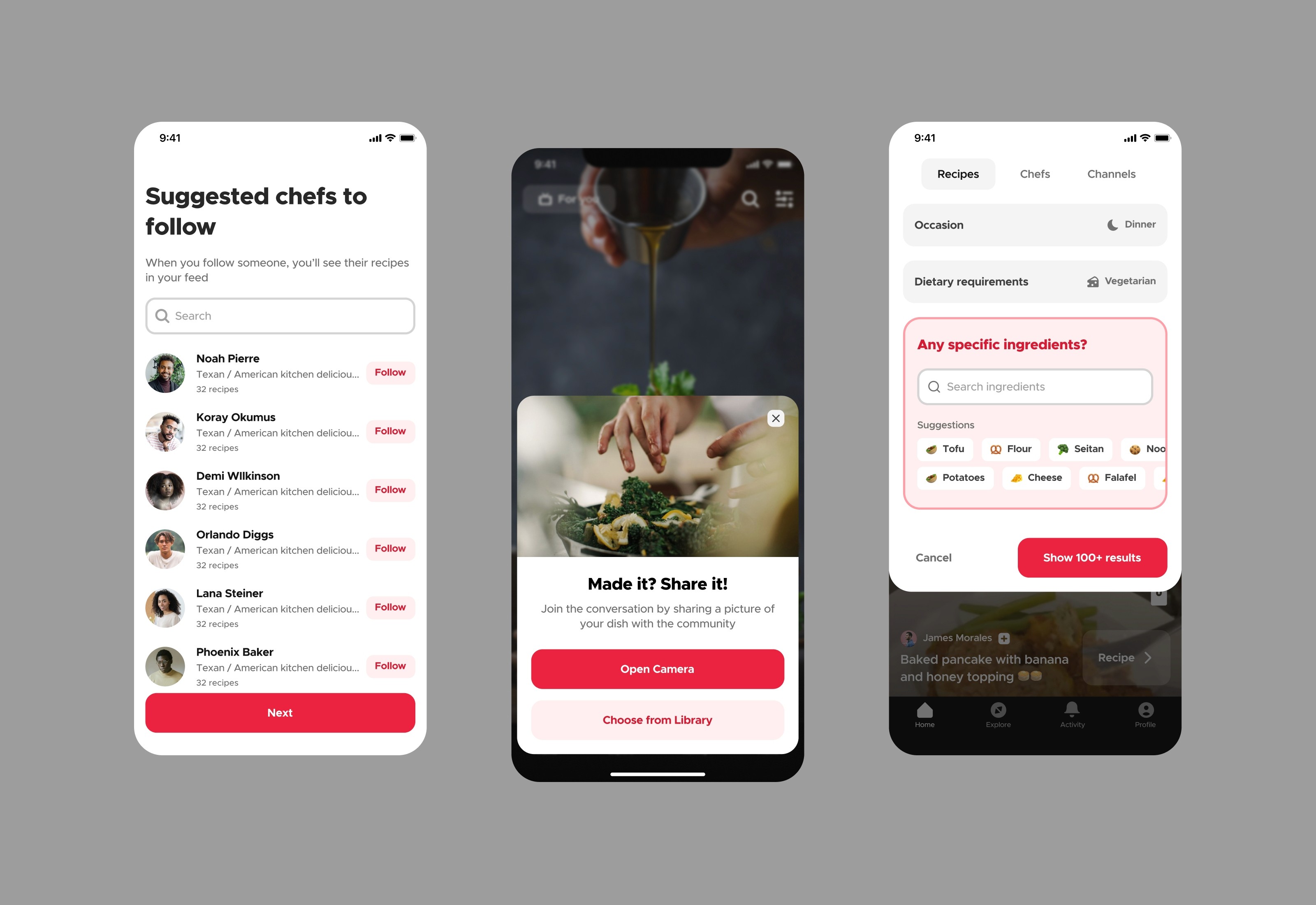
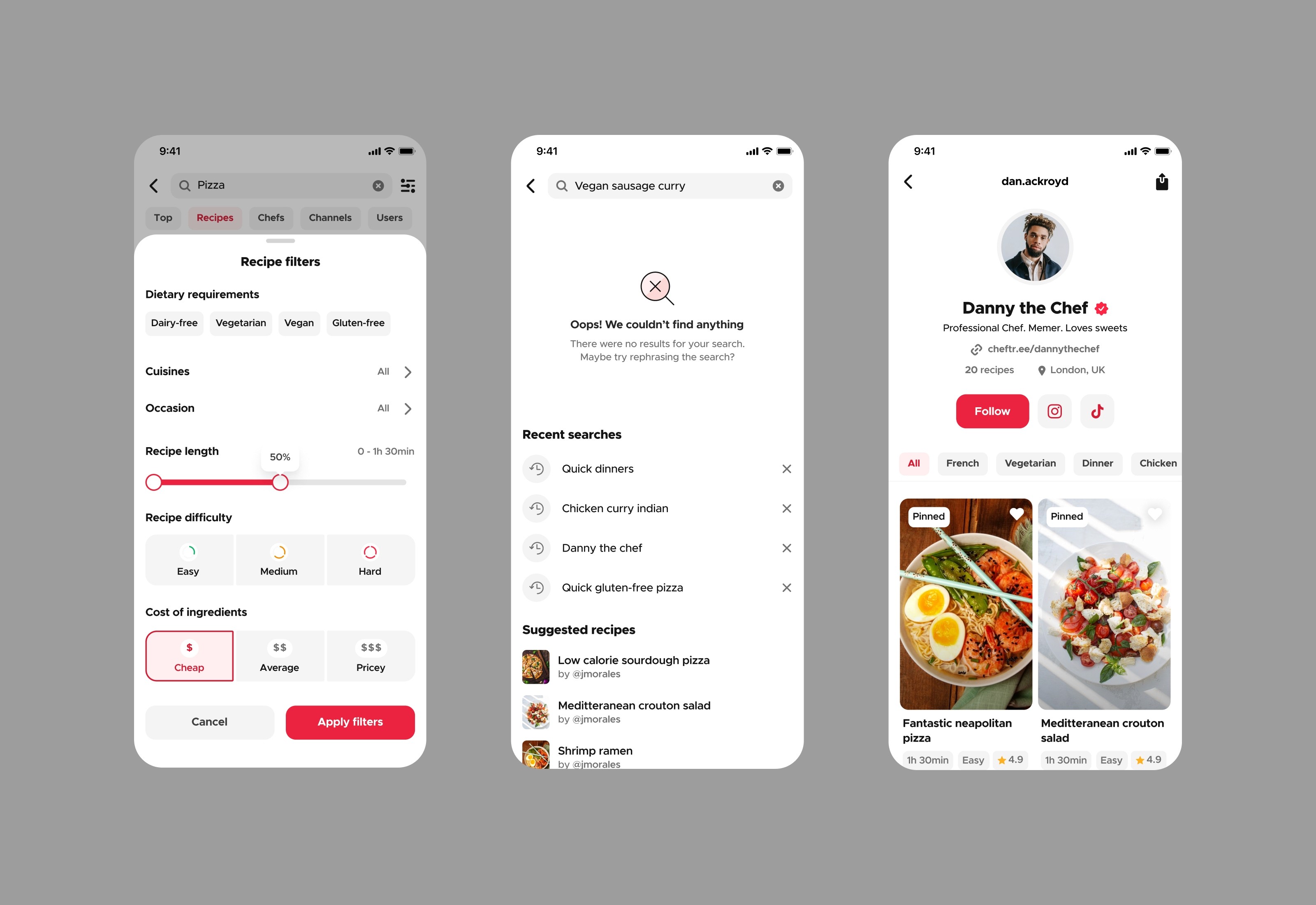
Our plan to upgrade the MVP application was to create a new visual language that helps users focus on the content, especially since most of it is video and images. The client also wanted the brand to stand out from the typical recipe apps, hence we applied a bright colour palette with red as the primary one as requested.
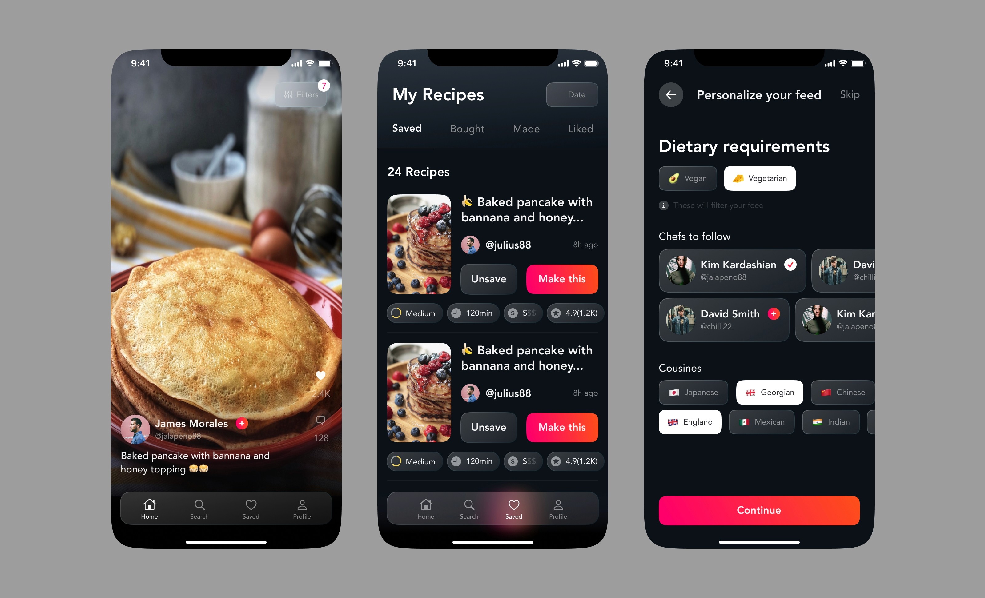
Old app before the redesign
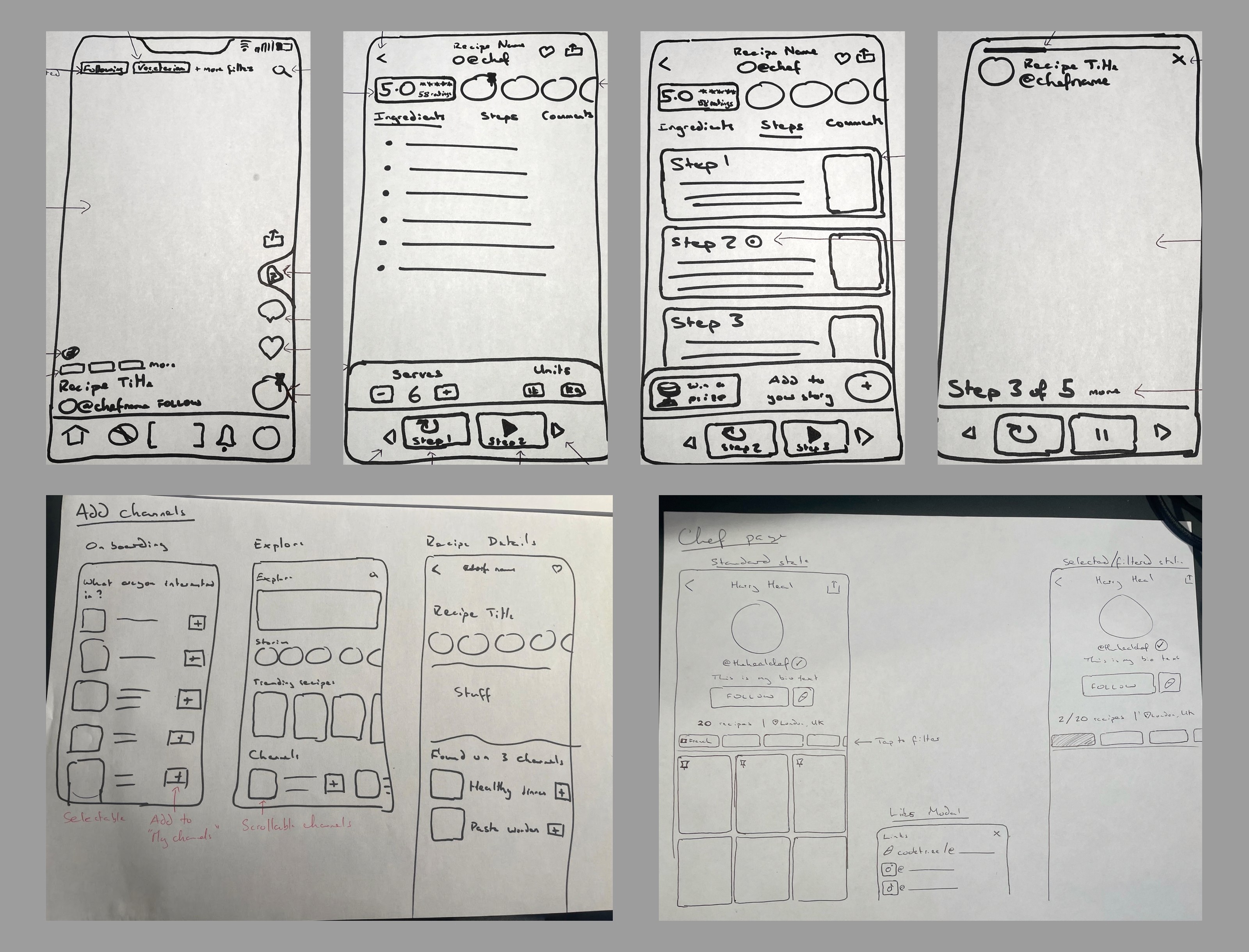
Sketches of the redesign. Before designing, we were always sketching out different page layouts. The client would also send me sketches they drew to visualise some of the ideas of layouts they had.